Showing posts with label Blogger Menus. Show all posts

Monday, 7 January 2013

Pure CSS3 Multi Level Drop Down Menu For Blogger V1

0 comments
I recently posted Add Smooth Multi Level Drop-Down Menu In Blogger. But this is simple, smooth not just a perfect good looking Stylish Pure CSS3 Multi Level Drop Down Menu. Now I comes with Stylish Pure CSS3 Multi Level Drop Down Menu For Blogger. This menu is purely designed with CSS3 and No Images, No javascript is included in it. It is compatible for almost all browsers like Mozilla Firefox and Google Chrome etc but the rounded corners and shadow will not be rendered properly. This menu is provided bywebDesignerWall. I have made installation method very easy you just need to copy and paste the code to where you want Multi Level Drop Down Menu to appear.

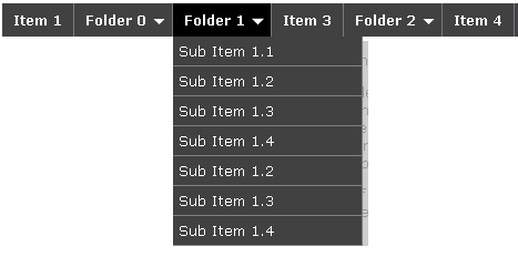
Pure CSS3 Multi Level Drop Down Menu Preview

Add Multi Level Drop Down Menu To Blogger

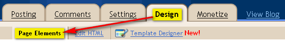
  1. Go To Blogger > Design
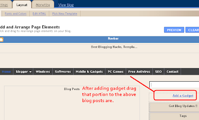
  2. Click on “Add a Gadget”
  3. Choose HTML/Javascript widget
  4. Paste the following code inside it
<style>
#ABT-Container  {
    font: normal .8em/1.5em Arial, Helvetica, sans-serif;
    background: #ebebeb;
     width:100%; float:left;    
}

a {
    color: #333;
}
#nav {
    margin: 0;
    padding: 7px 6px 0;
    line-height: 100%;
    border-radius: 2em;

    -webkit-border-radius: 2em;
    -moz-border-radius: 2em;
    
    -webkit-box-shadow: 0 1px 3px rgba(0, 0, 0, .4);
    -moz-box-shadow: 0 1px 3px rgba(0, 0, 0, .4);

    background: #8b8b8b; /* for non-css3 browsers */
    filter:  progid:DXImageTransform.Microsoft.gradient(startColorstr='#a9a9a9', endColorstr='#7a7a7a'); /* for IE */
    background: -webkit-gradient(linear, left top, left bottom, from(#a9a9a9), to(#7a7a7a)); /* for webkit browsers */
    background: -moz-linear-gradient(top,  #a9a9a9,  #7a7a7a); /* for firefox 3.6+ */

    border: solid 1px #6d6d6d;
}
#nav li {
    margin: 0 5px;
    padding: 0 0 8px;
    float: left;
    position: relative;
    list-style: none;
}
/* main level link */
#nav a {
    font-weight: bold;
    color: #e7e5e5;
    text-decoration: none;
    display: block;
    padding:  8px 20px;
    margin: 0;
    -webkit-border-radius: 1.6em;
    -moz-border-radius: 1.6em;
    text-shadow: 0 1px 1px rgba(0, 0, 0, .3);
}
/* main level link hover */
#nav .current a, #nav li:hover > a {
    background: #d1d1d1; /* for non-css3 browsers */
    filter:  progid:DXImageTransform.Microsoft.gradient(startColorstr='#ebebeb', endColorstr='#a1a1a1'); /* for IE */
    background: -webkit-gradient(linear, left top, left bottom, from(#ebebeb), to(#a1a1a1)); /* for webkit browsers */
    background: -moz-linear-gradient(top,  #ebebeb,  #a1a1a1); /* for firefox 3.6+ */

    color: #444;
    border-top: solid 1px #f8f8f8;
    -webkit-box-shadow: 0 1px 1px rgba(0, 0, 0, .2);
    -moz-box-shadow: 0 1px 1px rgba(0, 0, 0, .2);
    box-shadow: 0 1px 1px rgba(0, 0, 0, .2);
    text-shadow: 0 1px 0 rgba(255, 255, 255, .8);
}
/* sub levels link hover */
#nav ul li:hover a, #nav li:hover li a {
    background: none;
    border: none;
    color: #666;
    -webkit-box-shadow: none;
    -moz-box-shadow: none;
}
#nav ul a:hover {
    background: #0399d4 !important; /* for non-css3 browsers */
    filter:  progid:DXImageTransform.Microsoft.gradient(startColorstr='#04acec', endColorstr='#0186ba'); /* for IE */
    background: -webkit-gradient(linear, left top, left bottom, from(#04acec), to(#0186ba)) !important; /* for webkit browsers */
    background: -moz-linear-gradient(top,  #04acec,  #0186ba) !important; /* for firefox 3.6+ */

    color: #fff !important;
    -webkit-border-radius: 0;
    -moz-border-radius: 0;
    text-shadow: 0 1px 1px rgba(0, 0, 0, .1);
}
/* level 2 list */
#nav ul {
    background: #ddd; /* for non-css3 browsers */
    filter:  progid:DXImageTransform.Microsoft.gradient(startColorstr='#ffffff', endColorstr='#cfcfcf'); /* for IE */
    background: -webkit-gradient(linear, left top, left bottom, from(#fff), to(#cfcfcf)); /* for webkit browsers */
    background: -moz-linear-gradient(top,  #fff,  #cfcfcf); /* for firefox 3.6+ */

    display: none;
    margin: 0;
    padding: 0;
    width: 185px;
    position: absolute;
    top: 35px;
    left: 0;
    border: solid 1px #b4b4b4;
    -webkit-border-radius: 10px;
    -moz-border-radius: 10px;
    border-radius: 10px;
    -webkit-box-shadow: 0 1px 3px rgba(0, 0, 0, .3);
    -moz-box-shadow: 0 1px 3px rgba(0, 0, 0, .3);
    box-shadow: 0 1px 3px rgba(0, 0, 0, .3);
}
/* dropdown */
#nav li:hover > ul {
    display: block;
}
#nav ul li {
    float: none;
    margin: 0;
    padding: 0;
}
#nav ul a {
    font-weight: normal;
    text-shadow: 0 1px 1px rgba(255, 255, 255, .9);
}
/* level 3+ list */
#nav ul ul {
    left: 181px;
    top: -3px;
}
/* rounded corners for first and last child */
#nav ul li:first-child > a {
    -webkit-border-top-left-radius: 9px;
    -moz-border-radius-topleft: 9px;
    -webkit-border-top-right-radius: 9px;
    -moz-border-radius-topright: 9px;
}
#nav ul li:last-child > a {
    -webkit-border-bottom-left-radius: 9px;
    -moz-border-radius-bottomleft: 9px;
    -webkit-border-bottom-right-radius: 9px;
    -moz-border-radius-bottomright: 9px;
}
/* clearfix */
#nav:after {
    content: ".";
    display: block;
    clear: both;
    visibility: hidden;
    line-height: 0;
    height: 0;
}
#nav {
    display: inline-block;
}
html[xmlns] #nav {
    display: block;
}
* html #nav {
    height: 1%;
}
</style>

<div id="ABT-Container">
<ul id="nav"><li><a href="#">Home</a></li>
<li><a href="#">Technology Tricks</a>
<ul>
<li><a href="#">Sub-Row</a>
<ul>
<li><a href="#">Sub Sub-Row 1</a></li>
</a></li></ul>
</li>
<li><a href="#">Sub-Row</a>
<ul>
               
<li><a href="#">Sub Sub-Row 2</a></li>
</ul>
</li>
<li><a href="#">Sub-Row</a></li>
</ul>
</li>

<li><a href="#">Multi-Levels</a>
<ul>
<li><a href="#">Team</a>
<ul>
<li><a href="#">Sub-Level Item 1</a></li>
<li><a href="#">Sub-Level Item 1</a>
<ul>
<li><a href="#">Sub-Level Item 11</a></li>
<li><a href="#">Sub-Level Item 22</a></li>
<li><a href="#">Sub-Level Item 33</a></li>
</ul>
</li>
                   
<li><a href="#">Sub-Level Item 1</a></li>
</ul>
</li>
<li><a href="#">Sales</a></li>
<li><a href="#">Another Link</a></li>
<li><a href="#">Department</a>
<ul>
<li><a href="#">Sub-Level Item 2</a></li>
</ul>
</li>
</ul>
</li><li><a href="#">Home</a></li>   
<li><a href="#">About Me</a></li>
<li><a href="#">Contact Me</a></li>
<li><a href="#">Blogger Tutorials</a></li>


</ul>
</div>

The best part about this Multi Level Drop Down Menu is that you can give it any colour you want because here we are using a transparent gradient image which can take any colour you want. Like:

Now kindly make these customization changes to add your own links to menu:
  • Each TAB can be edited by directly understanding the following  HTML code,
<li><a href=”#“>TAB TEXT</a></li>
In each case replace the hash sign (#) with your page URL or link and replace the text with your page title. I have kept the page titles unchanged in the code above so that you could easily edit them by seeing the demo.
This is V1 of Multi Level Drop Down Menu. I will soon publish another article on this cool Multi Level Drop Down Menu. Till than stay tune!

Confused or Need Help?

If you need some extra help in removing rows or columns then please feel free to post your questions. You can discus it as much with me as possible. This will help others to better understand on how to make further changes. :D

Add Smooth Multi Level Drop-Down Menu In Blogger

0 comments
Now you can easily Add Navigation Menu in Blogger with ease. Smooth Navigation Menu is a multi level, CSS list based menu powered using jQuery that makes website navigation a smooth and that’s a good thing given the important role of this element in any site.


Steps To Add Smooth Multi Level Drop-Down Menu In Blogger

Note: Before making any changes to your template, take a full backup of your blogger template.
#Step 1. Log in to your Blogger Dashboard and Navigate to Design > Edit HTML.
Design Edit HTML

#Step 2. Find this code:</head> and replace it wit this code:
<link href=’https://sites.google.com/site/addinblogger/how-to-add-in-blogger/ddsmoothmenu.css’ rel=’stylesheet’ type=’text/css’/>
<link href=’https://sites.google.com/site/addinblogger/how-to-add-in-blogger/ddsmoothmenu-v.css’ rel=’stylesheet’ type=’text/css’/>
<script src=’http://ajax.googleapis.com/ajax/libs/jquery/1.2.6/jquery.min.js’ type=’text/javascript’/>
<script src=’https://sites.google.com/site/addinblogger/how-to-add-in-blogger/ddsmoothmenu.js’ type=’text/javascript’>
/***********************************************
* Smooth Navigational Menu- (c) Dynamic Drive DHTML code library (www.dynamicdrive.com)
* This notice MUST stay intact for legal use
* Visit Dynamic Drive at http://www.dynamicdrive.com/ for full source code
***********************************************/
</script>
<script type=’text/javascript’>
ddsmoothmenu.init({
mainmenuid: “smoothmenu1″, //menu DIV id
orientation: ‘h’, //Horizontal or vertical menu: Set to “h” or “v”
classname: ‘ddsmoothmenu’, //class added to menu’s outer DIV
//customtheme: ["#1c5a80", "#18374a"],
contentsource: “markup” //”markup” or ["container_id", "path_to_menu_file"] })
ddsmoothmenu.init({
mainmenuid: “smoothmenu2″, //Menu DIV id
orientation: ‘v’, //Horizontal or vertical menu: Set to “h” or “v”
classname: ‘ddsmoothmenu-v’, //class added to menu’s outer DIV
//customtheme: ["#804000", "#482400"],
contentsource: “markup” //”markup” or ["container_id", "path_to_menu_file"] })
</script>
</head>
#Step 3. Now navigate to Design > Page Element and click on Add a Gadget > HTML/Javascript and insert the following code and click Save button.
Design-Page Element
<h2>Example 1</h2>
<div id=”smoothmenu1″>
<ul>
<li><a href=”http://bloggerhowtotips.blogspot.com/”>Blogger How To Tips</a></li>
<li><a href=”#”>Folder 0</a>
<ul>
<li><a href=”#”>Sub Item 1.1</a></li>
<li><a href=”#”>Sub Item 1.2</a></li>
<li><a href=”#”>Sub Item 1.3</a></li>
<li><a href=”#”>Sub Item 1.4</a></li>
<li><a href=”#”>Sub Item 1.2</a></li>
<li><a href=”#”>Sub Item 1.3</a></li>
<li><a href=”#”>Sub Item 1.4</a></li>
</ul>
</li>
<li><a href=”#”>Folder 1</a>
<ul>
<li><a href=”#”>Sub Item 1.1</a></li>
<li><a href=”#”>Sub Item 1.2</a></li>
<li><a href=”#”>Sub Item 1.3</a></li>
<li><a href=”#”>Sub Item 1.4</a></li>
<li><a href=”#”>Sub Item 1.2</a></li>
<li><a href=”#”>Sub Item 1.3</a></li>
<li><a href=”#”>Sub Item 1.4</a></li>
</ul>
</li>
<li><a href=”#”>Item 3</a></li>
<li><a href=”#”>Folder 2</a>
<ul>
<li><a href=”#”>Sub Item 2.1</a></li>
<li><a href=”#”>Folder 2.1</a>
<ul>
<li><a href=”#”>Sub Item 2.1.1</a></li>
<li><a href=”#”>Sub Item 2.1.2</a></li>
<li><a href=”#”>Folder 3.1.1</a>
<ul>
<li><a href=”#”>Sub Item 3.1.1.1</a></li>
<li><a href=”#”>Sub Item 3.1.1.2</a></li>
<li><a href=”#”>Sub Item 3.1.1.3</a></li>
<li><a href=”#”>Sub Item 3.1.1.4</a></li>
<li><a href=”#”>Sub Item 3.1.1.5</a></li>
</ul>
</li>
<li><a href=”#”>Sub Item 2.1.4</a></li>
</ul>
</li>
</ul>
</li>
<li><a href=”http://allbloggingtips.com/”>All Blogging Tips</a></li>
</ul>
<br style=”clear: left” />
</div>
<h2 style=”margin-top:200px”>Example 2</h2>
<div id=”smoothmenu2″>
<ul>
<li><a href=”http://allbloggingtips.com/”>Blogger Tips and Tricks</a></li>
<li><a href=”#”>Folder 0</a>
<ul>
<li><a href=”#”>Sub Item 1.1</a></li>
<li><a href=”#”>Sub Item 1.2</a></li>
<li><a href=”#”>Sub Item 1.3</a></li>
<li><a href=”#”>Sub Item 1.4</a></li>
<li><a href=”#”>Sub Item 1.2</a></li>
<li><a href=”#”>Sub Item 1.3</a></li>
<li><a href=”#”>Sub Item 1.4</a></li>
</ul>
</li>
<li><a href=”#”>Folder 1</a>
<ul>
<li><a href=”#”>Sub Item 1.1</a></li>
<li><a href=”#”>Sub Item 1.2</a></li>
<li><a href=”#”>Sub Item 1.3</a></li>
<li><a href=”#”>Sub Item 1.4</a></li>
<li><a href=”#”>Sub Item 1.2</a></li>
<li><a href=”#”>Sub Item 1.3</a></li>
<li><a href=”#”>Sub Item 1.4</a></li>
</ul>
</li>
<li><a href=”#”>Item 3</a></li>
<li><a href=”#”>Folder 2</a>
<ul>
<li><a href=”#”>Sub Item 2.1</a></li>
<li><a href=”#”>Folder 2.1</a>
<ul>
<li><a href=”#”>Sub Item 2.1.1</a></li>
<li><a href=”#”>Sub Item 2.1.2</a></li>
<li><a href=”#”>Folder 3.1.1</a>
<ul>
<li><a href=”#”>Sub Item 3.1.1.1</a></li>
<li><a href=”#”>Sub Item 3.1.1.2</a></li>
<li><a href=”#”>Sub Item 3.1.1.3</a></li>
<li><a href=”#”>Sub Item 3.1.1.4</a></li>
<li><a href=”#”>Sub Item 3.1.1.5</a></li>
</ul>
</li>
<li><a href=”#”>Sub Item 2.1.4</a></li>
</ul>
</li>
</ul>
</li>
<li><a href=”http://allbloggingtips.com/”>All Blogspot Tips</a></li>
</ul>
<br style=”clear: left” />
</div>
#Step 4. Save template and done!.
add menu in blogger

After adding the menu your blog layout will be look like in image above, as usual if you have any doubt please comment.

Advertisement


Copyright 2008 All Rights Reserved Revolution Two Church theme by Brian Gardner Converted into Blogger Template by Bloganol dot com